
Any business will have periodic sales. It doesn’t need to be a big sale, it could just be some reductions on price. A sale can be a real event, such as a celebration or a promotion in the business cycle that serves to bring in the shoppers who really were not thinking of buying. To be successful, a sale needs as much planning and preparation as any other fashion promotion and, as always, the accent is on fashion and on maintaining the store’s image (Pegler, 2012). We find sales during seasonal changes. For example, before entering your favorite store a big sign with big fonts on the window may capture your attention since it says something like 50% off on summer merchandise. Other times, you may find sales promotion during events like July 4th, Thanksgiving, Black Friday or Christmas. Store anniversaries are good moments to think about sales too. Store anniversary sales are a good way to be thankful to those loyal customers who visit the retail store. With those big signs and creative displays, store are not only generating traffic and getting customers interest to enter a store, they are also generating brand awareness and new customers. An example of a store that does sale promotion events is Tommy Hilfiger (https://usa.tommy.com/en).
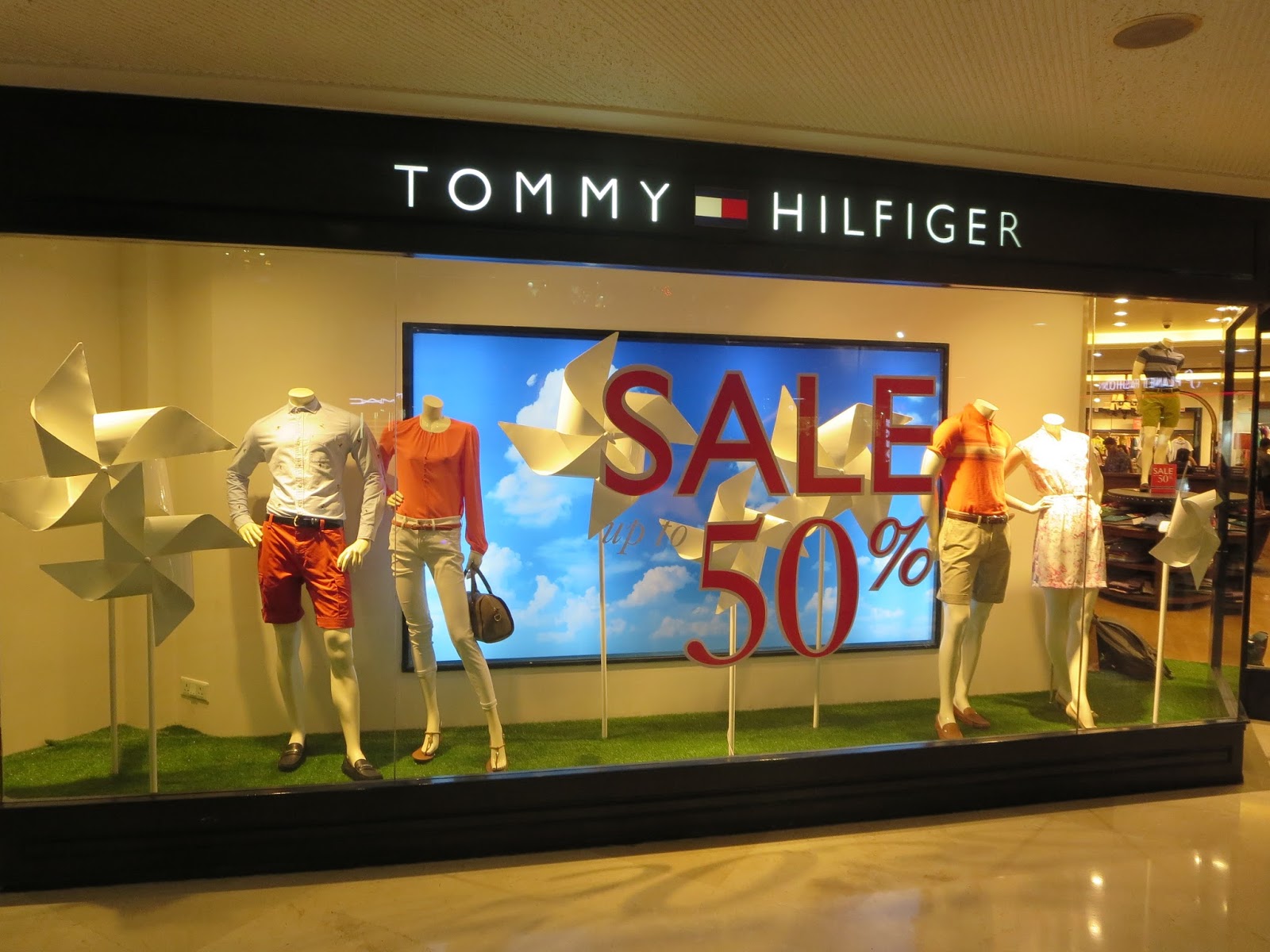
Above, we have a picture of a Tommy Hilfiger window display. In this visual display, the special promotion is for the Spring-Summer collection sale. The background is a screen of a blue sky with some clouds. There are giant pinwheels throughout the scene which symbolize the winds of spring and being outdoors. There are two pairs of mannequins on each side making a total of four mannequins. The mannequins have no heads, but the rest of their bodies are present, and they are in poses. The fact that they are posing in the clothing makes the mannequins look more sophisticated. The orange, khaki and white colors of the clothing, purses and shoes contrast the background, and look very fresh. The colors remind us of springtime. The floor has a bright green color simulating the grass of a backyard. The Tommy Hilfiger sign is on the top of the window. When people look at the composition, the eyes go directly to the center where the 50% sign is written in a big, red font. The red color is a very popular color chosen by stores for promoting sales and discounts. The red color has different meanings. It could mean something exciting, stimulating, loving, powerful, passionate, or also cheap. It conveys “sale,” “clearance,” warning (Pegler, 2012). Since this color is commonly used by stores to indicate discounts, people tend to very quickly associate the red letters or signs on the window with sales before even finishing to read the whole phrase. So, the customer’s eyes will be drawn first to the “Sale 50%.” Then, the view goes to one side and to the other of the composition. There is rhythm in the overall design. The elements of the display look proportional in sizes and heights. There are three big pinwheels in the back, and three small pinwheels in the front of the window. The message is simply that you will get a discount. It is an effective way to capture the attention of Tommy Hilfiger costumers or potential customers and cause them to enter the store. But, it is a tricky message, because if you look closely, there is a small “up to” in white that is not so visible due to the white pinwheels behind it. When you have a white font and white background behind, it is difficult for the customer to see it and might pass by it quickly. The lighting may be LED lighting, and the scene looks like a nice day with some winds of spring, in a green landscape.
Recommendations for any visual display about sales promotion is not to lose the store’s image. In this case, I think Tommy Hilfiger has made a sales discount display without losing the good taste. The customers of this brand are upscale shoppers and a display should match the brand personality. In relation to the props, the pinwheels’ white color combine as background for the sale announcement in red, but it doesn’t combine with the white letters that say “up to.” Unless this is made on purpose to distract customers, I believe it is much better be accurate when you do a promotion. In this case, they should write the whole phrase, “Sale up to 50%” in red. Customers want to feel that they are getting a real discount and this may cause them to feel cheated. And, in my view, the open lateral is distracting. I would close the open side with a panel that matches the color of the rest of the composition. A display for a sale event should always keep good style, taste, and imagination. It must respect the customer and merchandise being offered (Pegler, 2012).
References
Tommy Hilfiger (2019). Retrieved from:
https://usa.tommy.com/en
Pegler, Martin (2012), Visual Merchandising and Display. Sixth Edition. Fairchild Books. NY.
Porter, Jane (2012). 7 Tips to Create Winning Window Displays. Entrepreneur. Retrieved from:
https://www.entrepreneur.com/article/223677
